Customising Your Charts
Change the chart
- From the Customise Layout tab, locate the relevant page and click Customise.
- Find the chart you want to change, then click Change Chart.
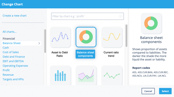
- In the Change Chart window select the chart you want to use. A brief description of the chart appears on the right-hand side, along with information about the data used.
- Once you're sure you want to use the chart, click Select.
If you can’t find the chart you’re looking for, you can create your own with our formula builder.

Change the chart settings
- From the Customise Layout tab, locate the relevant page and click Customise.
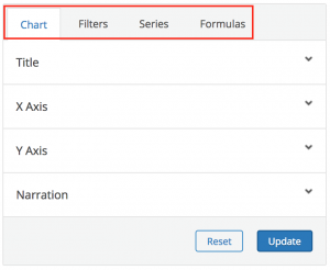
- Find the chart you want to customise and click Edit. The chart options appear on four tabs.
Note: The Formulas tab does not appear on certain charts. If the tab isn't visible, this means that the formulae on this chart can't be edited.

Change chart name and subtitle
- From the Customise Layout tab, locate the relevant page and click Customise.
- Find the chart you want to customise and click Edit.
- From the Chart tab, open the Title section.
- Make the required changes, then click Update.
Change X Axis / date range
- From the Customise Layout tab, locate the relevant page and click Customise.
- Find the chart you want to customise and click Edit.
- From the Chart’ tab, open the X Axis section.
- Select the required date range, then click Update.
Note: When the date range is set to Auto, the chart shows values for the current financial year.
Change Y Axis / unit
- From the Customise Layout tab, locate the relevant page and click Customise.
- Find the chart you want to customise and click Edit.
- From the Chart tab open the Y Axis section.
- Enter the required unit for the chart, and if required enter a new Min Value and Max Value.Note: To change the Min Value and Max Value, you must enter a different value for both. You cannot leave one value set to Auto.
- To save your changes, click Update.
The scale of the Y-axis is automatically adjusted to scale based on the min and max values.
Enter chart narration
- From the Customise Layout tab, locate the relevant page and click Customise.
- Find the chart you want to customise and click Edit.
- From the Chart tab open the Narration section.
- Enter the required text. You can find some default chart explanations here.
- To save your changes, click Update.
Change which data is displayed
Filter the data
You can filter a report in two circumstances:
- By Xero tracking categories, Quickbooks Online classes or MYOB jobs and categories.
- When running a Group Report, by organisation. You can use this option to show information for the organisations in the group side by side.
To filter the data:
- From the Customise Layout tab, locate the relevant page and click Customise.
- Find the chart you want to customise and click Edit.
- From the Filter section tab open the Tracking or Organisation section.
- Select the data series you want to see on the chart. This can be a single data series, or several to be displayed side by side.
- To save your changes, click Update.
If you want to change the series of data shown, you can create a custom graph and use our formula builder.
Change the formulae on the chart
On the majority of charts, you can edit the formulae and change which data appears on the chart. To do this, click the Formulas tab. You can then use the formula builder or formula gallery to change the data.
Change how data is displayed
Add or remove series of data from displaying on chart
- From the Customise Layout tab, locate the relevant page and click Customise.
- Find the chart you want to customise and click Edit.
- From the Series tab open the relevant section.
- Select or clear the Show check box as required
- To save the changes, click Update.
If you want to change the series of data shown, you can create a custom graph and use our formula builder.
Rescale chart / remove months with zero balance
You can set a chart to automatically scale, removing any months at the beginning or end of the chart with a zero balance.
- From the Customise Layout tab, locate the relevant page and click Customise.
- Hover the mouse over the required chart, then select the Adjust to Best Fit check box.
Change type of graph
- From the Customise Layout tab, locate the relevant page and click Customise.
- Find the chart you want to customise and click Edit.
- From the Series tab open the relevant section.
- From the Type drop-down list, choose the type of chart you want to use. You can use Area, Bar, Curve, Line, Scatter or Horz Bar.
- To save your changes, click Update.
Change colours of graph
- From the Customise Layout tab, locate the relevant page and click Customise.
- Find the chart you want to customise and click Edit.
- From the Series’ tab open the relevant section.
- Click the colour block and choose the required colour.
- To save your changes, click Update.
Change title of data set
- From the Customise Layout tab, locate the relevant page and click Customise.
- Find the chart you want to customise and click Edit.
- From the Series tab open the relevant section.
- Select the Title check box and enter the required title.
- To save your changes, click Update.
Add or remove projection line
- From the Customise Layout tab, locate the relevant page and click Customise.
- Find the chart you want to customise and click Edit.
- From the Series tab open the relevant section.
- Select or clear the Projection check box as required.
- To save your changes, click Update.
If the projection line doesn’t show, please ensure you have imported or manually entered budget figures in your Customise Data tab.
Add or remove trend line
- From the Customise Layout tab, locate the relevant page and click Customise.
- Find the chart you want to customise and click Edit.
- From the Series tab open the relevant section.
- Select or clear the Trend check box as required to display a logarithmic trend line.
- To save your changes, click Update.
Stack or unstack data
Stacking data useful for showing the breakdown of a certain total e.g. Cash on Hand and Receivables to represent potential cash on hand balance.
- From the Customise Layout tab, locate the relevant page and click Customise.
- Find the chart you want to customise and click Edit.
- From the Series tab open the relevant section.
- Select or clear the Stacked check box as required. If you select the check box, the data will be stacked against other series that are stacked.
- To save your changes, click Update.
Add or remove marker
Some graphs (Area, Curve, Line, Scatter) are complemented by a marker to easily identify the month end value. You have a selection of diamond, dot, point or star markers.
- From the Customise Layout tab, locate the relevant page and click Customise.
- Find the chart you want to customise and click Edit.
- From the Series tab open the relevant section.
- From the Marker drop-down list, choose the marker you’d like to use. You can use a diamond, dot, point or star. To remove the marker, choose None.
- To save your changes, click Update.
When changing your chart, at any time you can click the Reset button to start customising your chart from scratch again.
Display values as data labels
If you prefer, you can show the exact values against each data point on the chart.
- From the Customise Layout tab, locate the relevant page and click Customise.
- Find the chart you want to customise and click Edit.
- From the Series tab, open the relevant section.
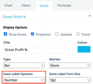
- From the Data Label Options drop-down list, choose the required label option. You can choose from the following:
Number
Number (1 decimal)
Number (2 decimals)

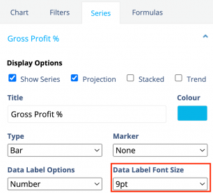
From the Data Label Font Size drop-down list, choose the required size for the label.

To save your changes and see the result, click Update.


